Missing children’s situations in Romania became the main focus of the media in 2019 when a kidnapped 15-year-old girl made three emergency calls to 112 while being held against her will by her kidnapper. Unfortunately, the emergency call operators considered her calls to be a prank, so the police decided to launch an investigation after 19 hours. But as their intervention arrived too late, the story ended tragically for the girl and her family.
This led to a public debate about how prepared are the authorities are to take action in similar cases, and what parents and other people could do to find the missing children as quickly as possible.
This was a personal project which took 8 weeks to complete (November-December 2019). The main objective was to identify and confirm a solution to the problem and then create a prototype.
I was responsible for research, wireframing, and prototyping and I collaborated with Stefan Twerdochlib, my mentor, who reviewed my progress and offered me suggestions, feedback and guidance along the project.
I focused my attention on the parents as I assumed they would be the most interested category in this subject.
At the outset of the project, the main scope was to identify the best solution for parents to find their missing children faster. I assumed that a mobile app for finding missing children could be a possible solution. In order to get validation for this idea I proceeded with the research phase, only to find out that a website would be more appropriate.
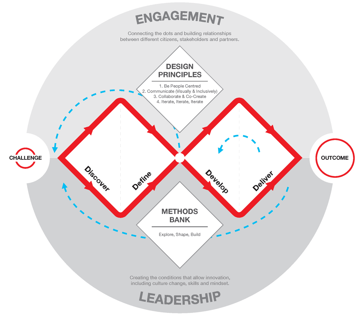
I approached the project with a human-centered design mindset, so I followed the steps of the double diamond model - Discover, Define, Develop, Deliver - combined with techniques from the Design Sprint toolkit.
In the beginning, I took a deep dive into a better understanding of the context by reading data reports from the authorities and press articles regarding missing children in the past few years. The gathered insights helped me create a better high-level perspective and formulate my questions for the next step - the users' interview.
I selected and interviewed 5 parents that were willing to talk about the subject. My goal was to validate the problem and explore its pain points and interests. The main topics were:
The collected data from the interviews, prior secondary research and the fact that I am also a parent helped me better empathize and understand the concerns of the audience.
Most parents consider their children are safe most of the time and also aware of possible dangers. Parents with children older than 10 years have already established a set of rules to keep them safe in unknown circumstances. They also have drills to follow when interacting with strangers or when they feel insecure in certain situations.
None of the parents knew of any app or website that could assist families with missing children and were concerned about the authorities’ attitude and slow response time in these cases. Most of them thought it was very important to try and prevent these situations by talking to their children about possible dangers, how to avoid them, and also who to ask for help if the situation requires it.
All of these insights helped me follow the next steps:
Parents have admitted that if their children go missing, they will most likely experience a feeling of anxiety and will find it difficult to just stand-by home and get updates from the police. Some parents thought they might rally their friends and relatives and organize their own search for the missing child.
At this point it was confirmed that the main feature of the website will come in handy and will offer parents a way to multiply the awareness of their situation by using multiple channels.
I also considered giving other users the opportunity to volunteer and get organized into search parties or simply act by themselves by printing the missing report and spreading it out where the missing was or might be seen.
While examining the research data, another opportunity was revealed: the parents expressed their interest in learning how to prevent these situations. My anticipation from the beginning of the project that a missing-children-finder app would solve the problem was proven to be incomplete by the results of the research. So, I decided to add a secondary feature: a learning section with information from trusted sources regarding the reasons children might go missing, and possibly dangerous situations for children and ways to react to them. The purpose of this feature is to prepare children and parents and teach them how to react in unsafe and dangerous situations.
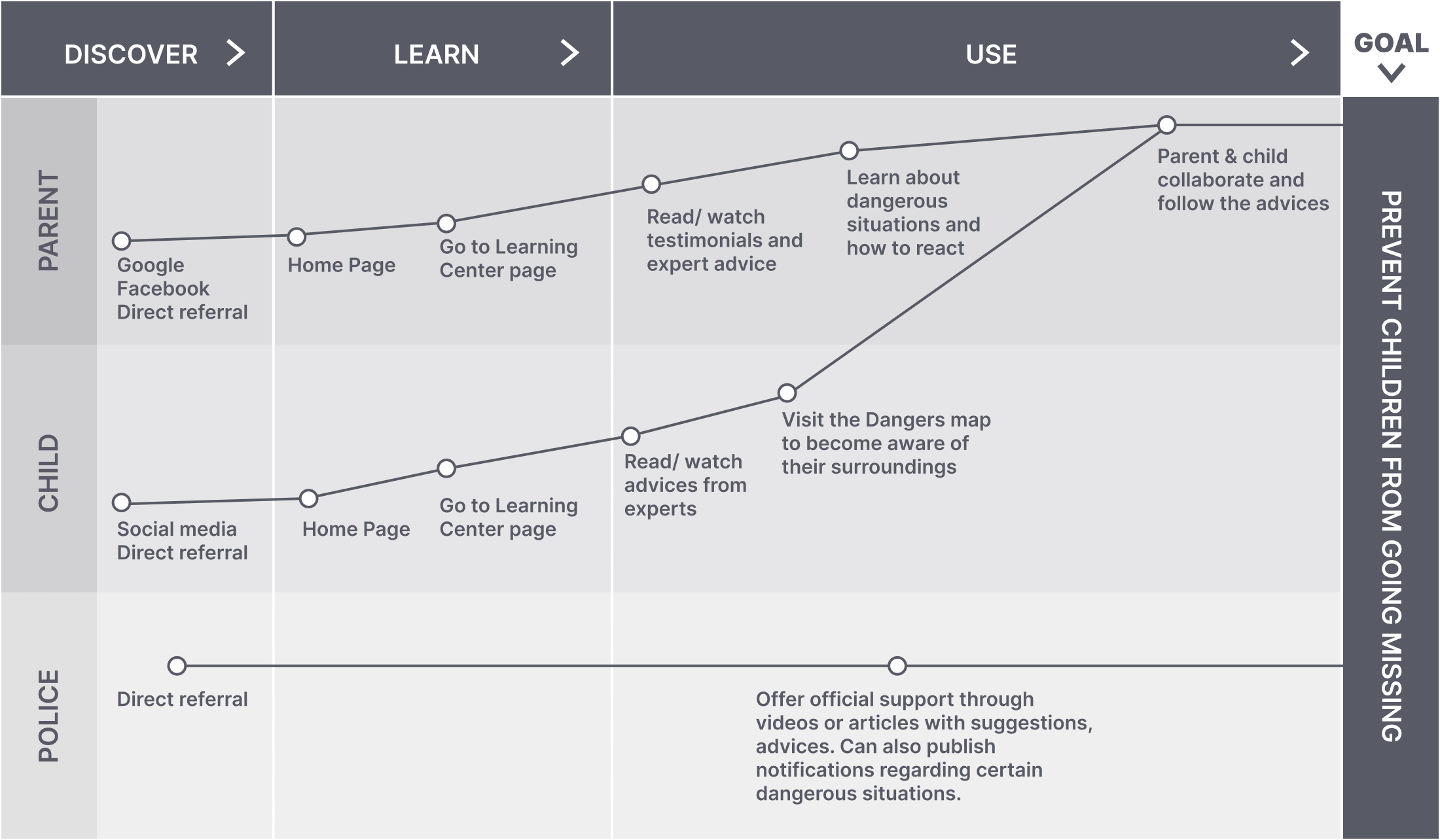
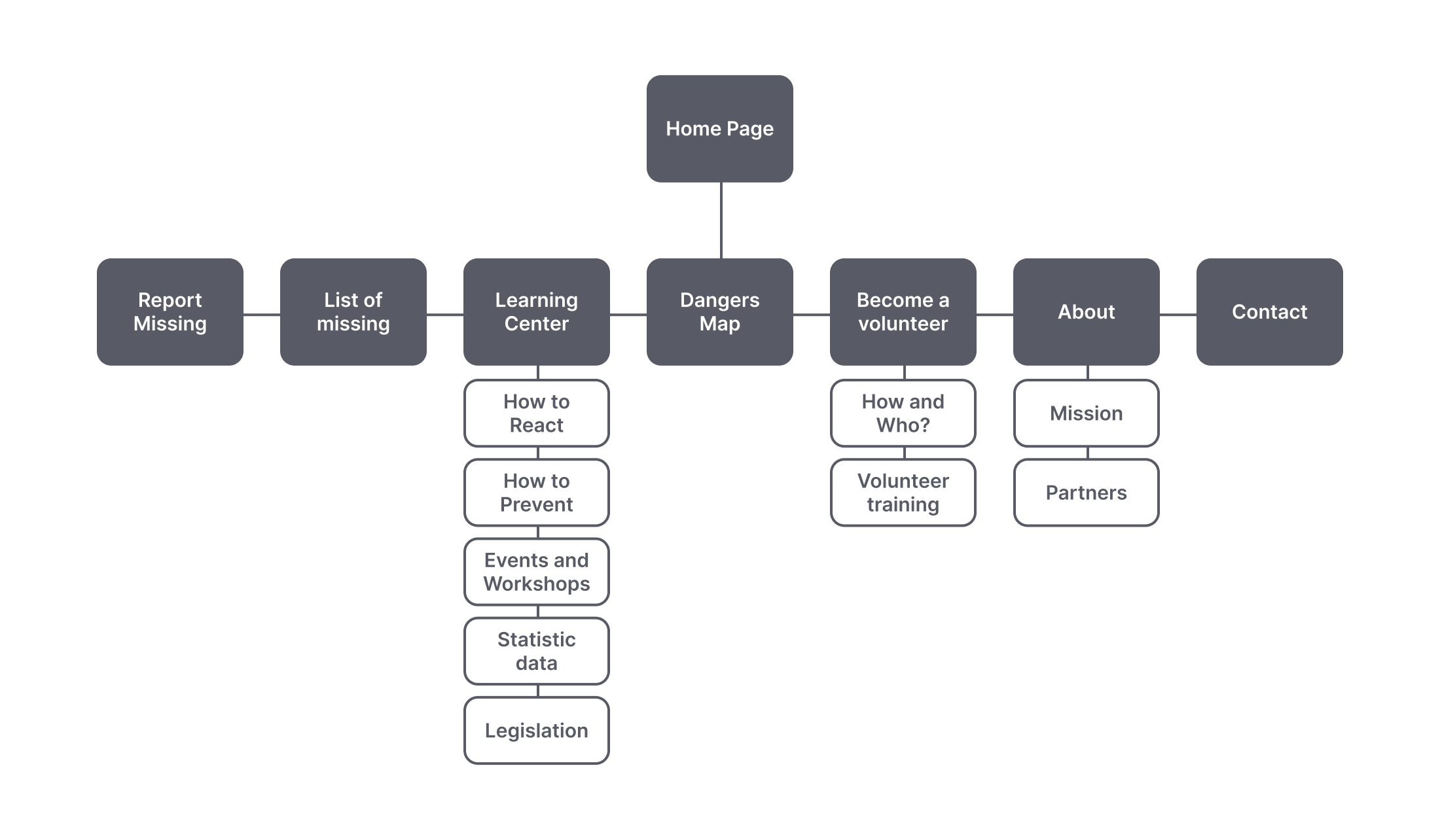
Before I jumped into designing the first wireframes I thought it was important to clarify the two features. So, after I created the Design Sprint map for the prevention feature I also simulated a user journey map for a scenario in which a parent wants to report a missing child. The outcome helped me better understand the users’ requirements for each feature and the necessary steps the users would take to reach their goals. It also helped me create a list of possible categories which I sorted out and organized into a site map.

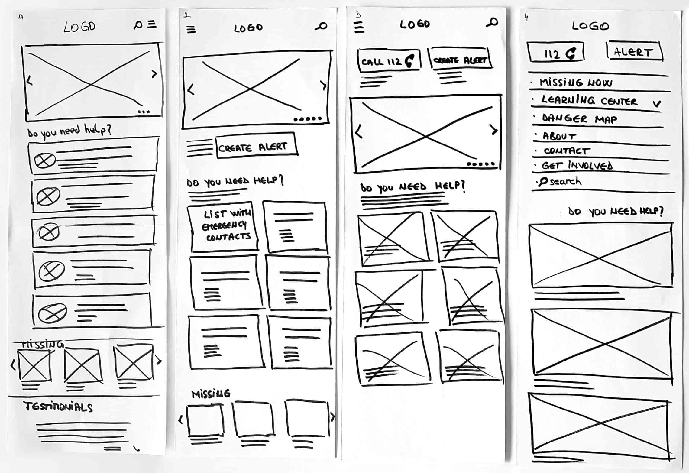
To obtain a high-level view of the website I continued by sketching the wireframes and then I moved on to prototyping the screens for the home page and for the missing child report page. I also ran usability tests for both of them with some of the parents from the users interview phase.
Reporting a missing child was considered the most important and urgent action a user would take when landing on the home page, so I placed a CTA button that leads to the report creation form right above the fold to be noticed faster without scrolling down. After they press the button users will have to go through 3 steps to complete the report for a missing child:
After the report is confirmed and published on the website, the parent can edit, share, or download it in printable format as a PDF. Anyone who visits the website can also see, share, or download. If people want to get involved further they can offer information on a missing child or volunteer in the search. With the consent of the author, the report can also be shared on other media channels to get better coverage (for instance: local TV or radio stations).
It is brought to the user’s attention right from the first step of the report that parents must contact the police first, so the authorities would open a file and start an investigation as soon as possible. The website doesn’t substitute the authorities and is only an extra option available for people looking for their missing children.
When I designed the wireframes for the home page, I created a few iterations. I tried to design a clean and easy to access interface, as I wanted to make sure that users have fast access to the CTA button of the main feature - Report missing child.
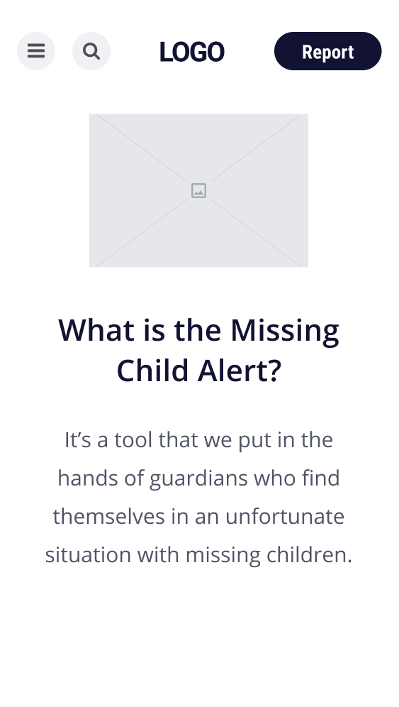
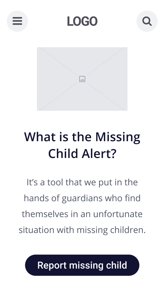
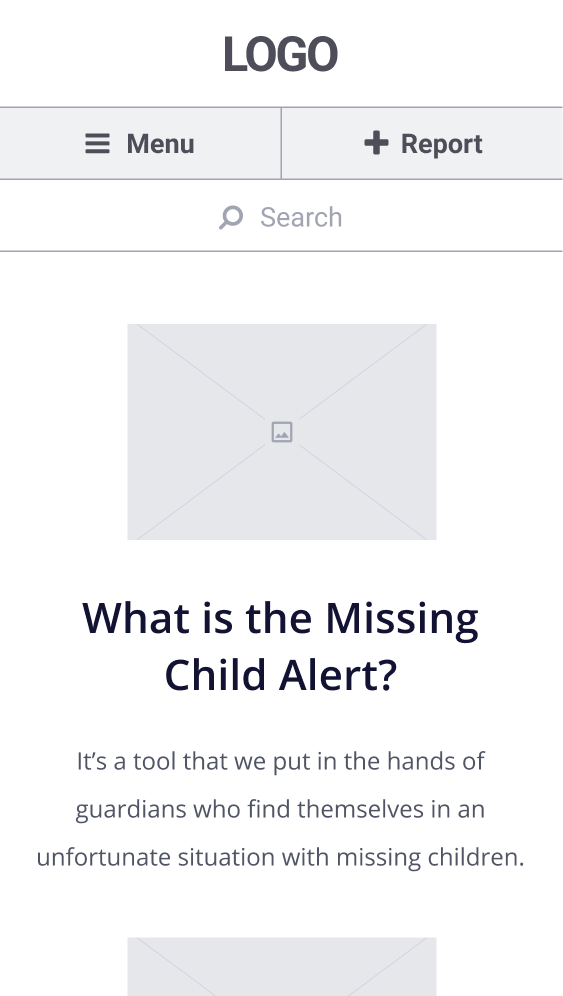
To further validate my solution, I did some usability tests by presenting users the prototype in a given scenario: they want to report a missing child and they have just landed on the home page of the website. I recorded their first action and then followed them through the report creation steps. The insights from the tests revealed to me that all the users had no problems finding the CTA button for the report creation form, but they considered the second step - that contained information about the missing child - was too long and it was taking too much time.
Following their feedback, I split the report-creating form into 4 steps instead of 3. I also changed the placeholders' labels as users declared themselves uncertain of what they had to write in some of the fields. I assumed adding icons for each field of the form would bring better visibility, but the user’s reactions in the second round of testing weren’t so positive, as the icons were considered to give the form a feeling of an e-commerce website. As this wasn't my purpose, I removed them to keep it simple and clean.
Click on the screens below to open a new tab and interact with the prototype
In hindsight, I’ve reached the initial objective: I identified the solution and created the prototype containing the home page and the main feature. Throughout the project, I learned how to use parts of the design sprint process to get from identifying the problem to the possible solutions and opportunities. I’ve also gained more experience in breaking down a project into the correct steps by applying the user-centered design approach by following the double-diamond framework steps. I tried focusing my efforts on the research and ideation phases as I considered that’s where I need to improve myself as a UX designer.
If I would start from scratch, I will try to involve in the first phase of the research a representative from the police who works on missing person cases. Although it would be more difficult, I will try to reach out to parents who went through the experience of a missing child. For the user interviews, I would focus my attention on parents from regions where missing children’s cases have happened more frequent.
Need a designer?