Team sports provide a reliable, consistent and fun way to exercise and keep ourselves in good health. But in the busy times we're living it's a challenge sometimes to find people to do sports with. When I used to play football with my friends I was also the organizer of our football meetings and many times it was challenging to find enough people to form the teams that also had an equal level so the game wouldn't get too unbalanced. I talked to other people that played different other sports about this issue and found out that many encountered similar difficulties in finding the right teammates. Most of them were trying to solve this by searching players in the local Facebook groups but many times this approach wasn't so successful.
I embarked on this project with two friends, both developers, one front-end, and the other one back-end. My role in the project consisted of UX design (research, wireframes), UI design (high fidelity prototype), and visual identity.
People who like doing sports on a regular basis, no matter the level of their performance, either individuals searching for teams or already established teams looking for other teammates.
We worked on this project in our free time as all of us had full-time jobs. We were pretty hyped at the beginning and we had lots of ideas for additional features. We decided to set our initial scope to create a fully functional mobile app. After the discovery phase, we realized it was unrealistic and difficult to achieve as we had limited resources to test and implement the features, so we realigned our primary goal to only create an MVP in the first phase.
We worked remotely, as we wanted to be more time-effective and communicated via Google Hangouts. We also tried having weekly face-to-face meetings so we could get through what we accomplished and what had to be done next.
We kicked-off the project with the research stage by scheduling user interviews for problem validation and identifying the pain points. I talked to people at the sports venues where they were doing their sport routine to find out if they had a hard time in finding teammates for their sports.
The insights revealed tome that many were using friends or colleagues recommendations for finding people, while some of them tried to solve the problem by joining sports-related Facebook groups and searching for teammates there. But even if Facebook groups provided a good pool to find people, they didn’t provide enough options in filtering and finding the right teammates, leaving the problem half-solved. Their main goal was finding other players or teams with equal levels in a certain sport, so the game would be balanced.
After the results from the research were synthesized, I identified the main pain points and opportunities and came up with a core value proposition for the MVP: Teamseek provides a solution to find amateur sports-people and helps them connect in a busy environment, in this way saving their time and helping them find a teammate feel less stressed. The X factor: we bring sports and friends together.
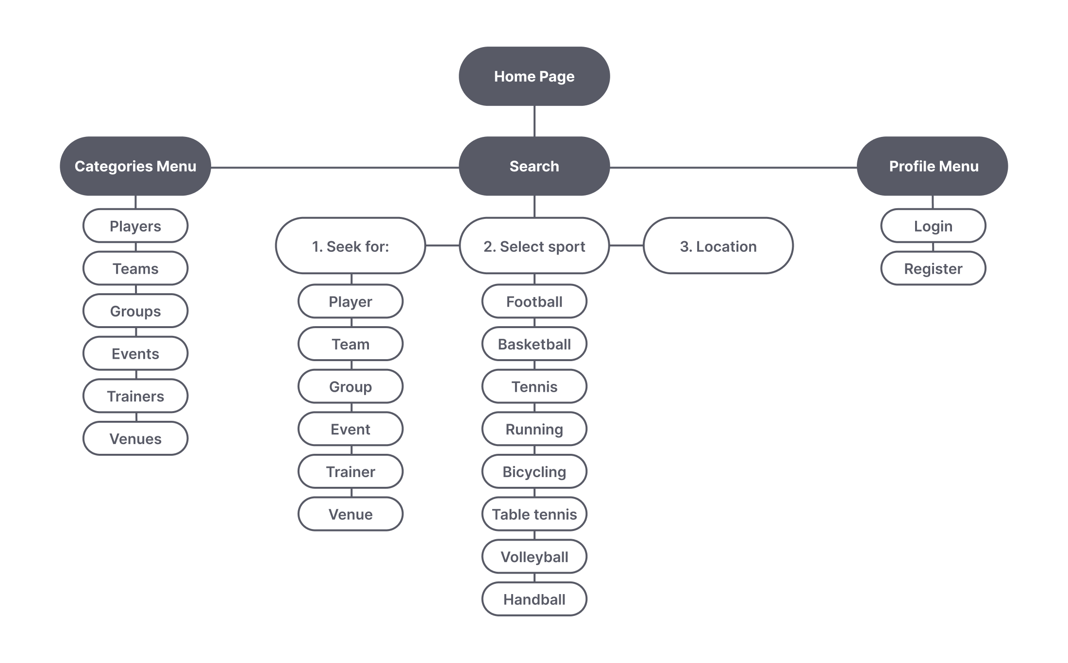
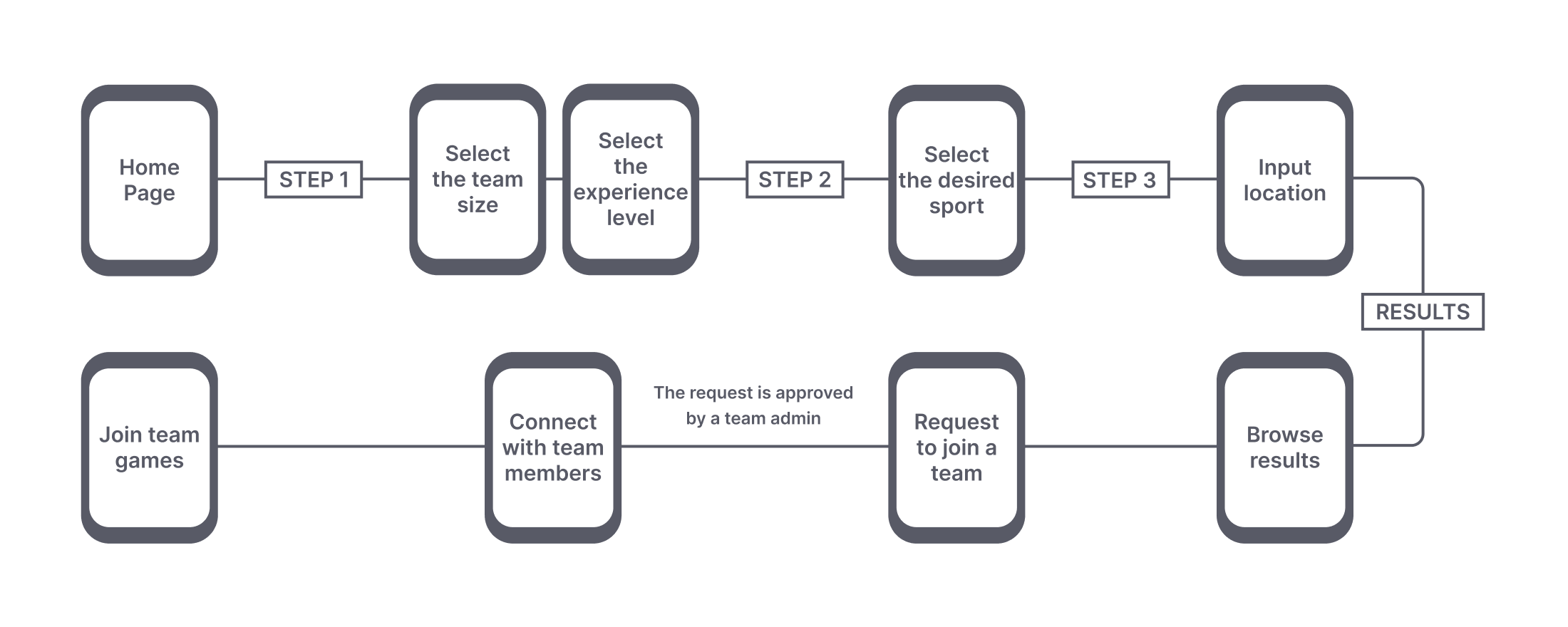
The findings helped me build a map of the app and a user journey for someone who is searching for a team. They helped me get a clearer view of the app architecture information.


With a mobile-first approach in mind, I began sketching the first wireframes for the searching feature as I considered it to be the most important. To validate the solution, I showcased it to some of the potential users and asked them for feedback. Most of them claimed that it was important when they searched for a teammate to spend as little time as possible, so I considered that being able to apply filters from the very start of the search experience was an advantage and would allow them to receive faster and better search results.
After the mobile prototype was ready, I conducted a remote usability testing session to validate the designed experience so far. Following the test and the users’ feedback, I discovered that the filtering options were too many and 70% of the users got lost and spent a long time going through them. I decided to make some adjustments so I sorted out some of the filters and placed them into categories, thus offering the users a more clear experience to follow through.
The tweaked version proved to be better as it allowed users to spend less time to complete the search and get the results.
Click on the screens below to open a new tab and interact with the prototype
Setting our goals too high from the start and wanting to deliver something too complex threw us into frustration until we realized we should only focus on an MVP which allowed the team to be better aligned on the tasks. Unfortunately, the limited resources, especially time, put the project on hold for an undetermined period.
If I would redo it, I would put more focus on managing the project more efficiently as I consider this was something that needed improvement and could have brought us much closer to our objective to create an MVP.
Need a designer?